

Role: Lead UX/UI Designer
Scope: Research, UX & UI Design, User Testing, Prototyping, Handoff
Overview
Fusion is the internal content management system used by The MomCo (formerly MOPS International) to manage events, members, and organizational content. Originally designed by developers in the early 2000s, the system had become outdated and frustrating to use. My goal was to completely rethink the experience, simplify workflows, and bring clarity to a tool that people relied on every day.
I led the UX and UI redesign from research through handoff, including user testing, information architecture, and the creation of a new component library. The result was a modern, consistent, and much more intuitive CMS that helped teams work faster, make fewer mistakes, and actually enjoy using the product again.
Fusion CMS: Problems & UX Diagnosis
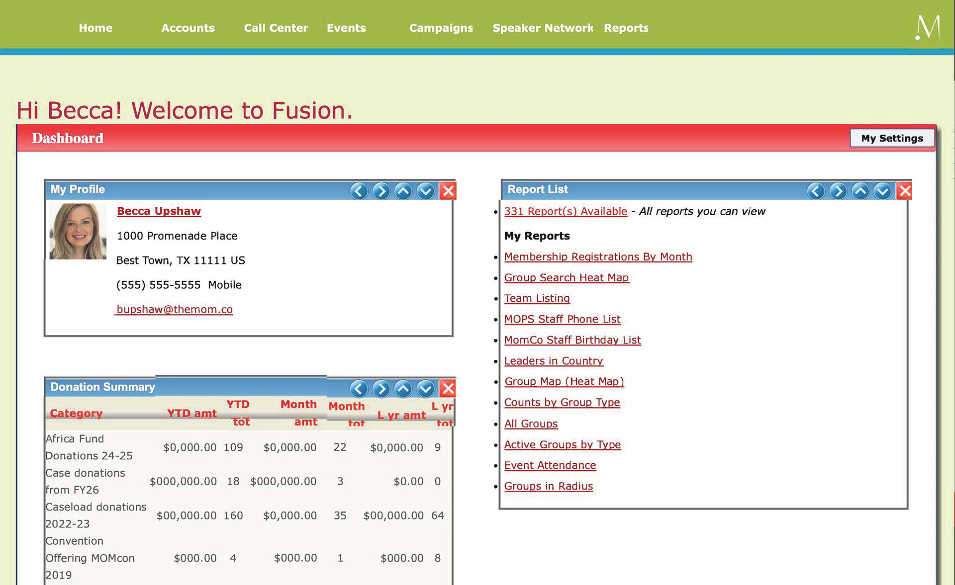
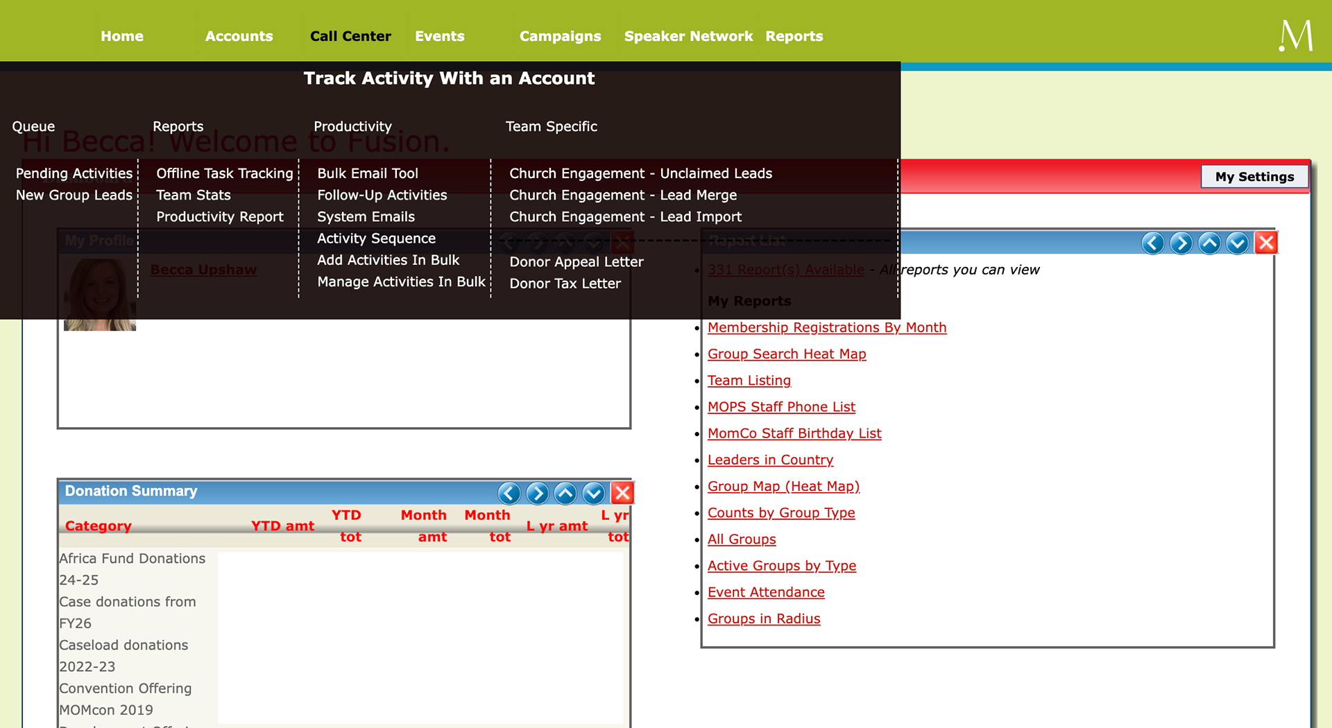
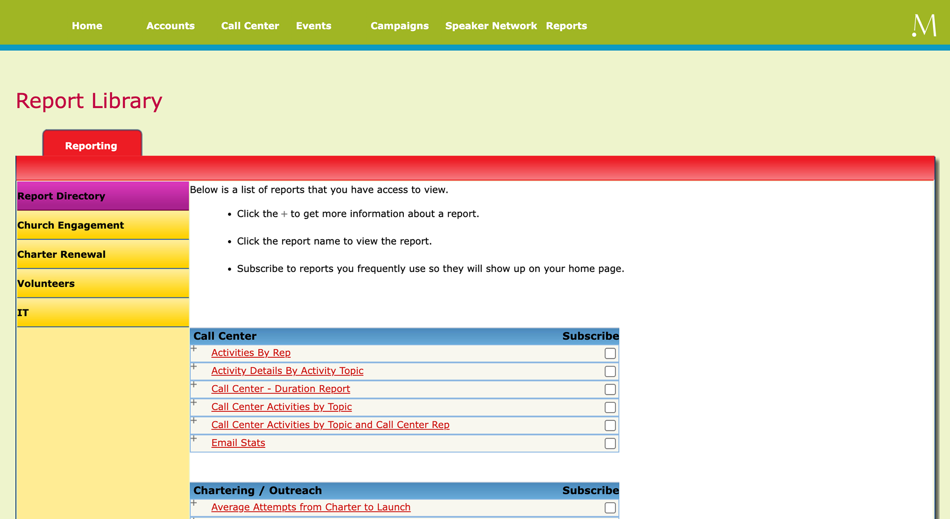
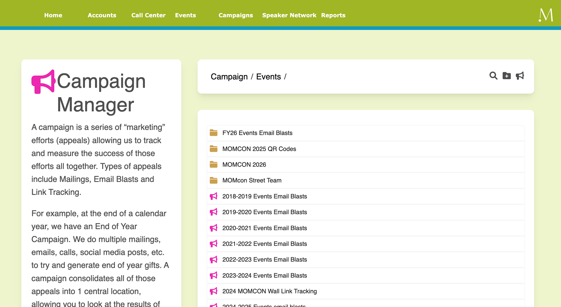
The original Fusion CMS was built on outdated architecture with inconsistent design patterns, limited component reuse, and unclear navigation hierarchies. Internal users struggled to locate, edit, and publish content efficiently.
When I began the redesign, it was clear the interface had been structured around backend logic rather than user needs. Over years of patchwork updates, it had become cluttered and inconsistent. Usability testing confirmed what users had been expressing for a long time: the system was slowing them down.
Main Problems Identified Through User Testing
1. Visual Overload and Poor Hierarchy
Problem: Users described the interface as “a wall of boxes.” The layout used too many colors, heavy borders, and little spacing.
2. Confusing Navigation
Problem: The multi-layered tab structure forced users to remember where things lived instead of guiding them intuitively.
3. Inconsistent Actions
Problem: Buttons like “Add,” “Edit,” and “Search” varied in placement and style across screens, leaving users unsure of expected results.
4. Accessibility and Readability
Problem: Red text on green backgrounds, tiny table fonts, and no sorting or filtering made data hard to scan.
5. No Clear Feedback
Problem: Users weren’t sure if tasks like saving or deleting had succeeded. Many repeated actions just to confirm.
6. Inefficient Workflows
Problem: Simple tasks required excessive clicks and manual entry, wasting time and increasing error rates.
7. Outdated Visual Design
Problem: Harsh gradients, inconsistent typography, and small text created a dated look that no longer reflected The MomCo brand.
8. Steep Learning Curve
Problem: New users in testing sessions had to rely on coworkers to understand how the system worked.
Planned Solutions:
1. Simplify the color palette, add whitespace, and use a single accent color for primary actions. (Related UX Principle: Law of Prägnanz - people understand simple visuals faster than complex ones.)
2. Reorganize the information architecture into a left-hand navigation with clear groupings and breadcrumbs. (Related UX Principle: Hick's Law - too many choices increase decision time.)
3. Create a component library to standardize buttons, forms, and visual hierarchy. (Related Heuristic: Consistency and Standards - users shouldn’t have to guess.)
4. Improve contrast ratios, increase type size, and add table sorting and filtering for faster scanning. (Related UX Principle: Fitts’s Law - small or low-contrast targets take more effort to use.)
5. Add real-time feedback with inline validation and success/error states for transparency. (Related Heuristic: Visibility of System Status - users should always know what’s happening.)
6. Streamline workflows with auto-filled fields and grouped steps.
7. Develop a modern, modular design system aligned with brand guidelines.
8. Introduce contextual onboarding and inline tooltips for first-time users. (Related UX Principle: Recognition over Recall - users should recognize what to do instead of remembering it.)
Summary
User testing, interviews, and heuristic evaluation revealed how a lack of cohesive design strategy had turned a functional tool into a daily frustration. Those findings became the foundation of a full redesign.
The goal wasn’t just to modernize the interface but to rebuild trust. The new Fusion CMS focuses on clarity, consistency, and confidence... giving internal teams a tool that finally feels intuitive, efficient, and aligned with the organization’s goals.
UX Strategy & Redesign Goals
Once the main problems became clear, I set out to design a system that felt easy, consistent, and trustworthy. The findings from user testing pointed to five key success factors: clarity, efficiency, consistency, accessibility, and trust.
1. Clarity
Users needed to see what mattered most without visual noise. I introduced breathing room, clearer hierarchy, and a simplified color palette that directed focus.
2. Efficiency
User testing showed that everyday tasks took too long. I shortened paths, minimized clicks, and prioritized frequently used actions.
3. Consistency
Each area of the old CMS behaved differently. I built a unified component library in Adobe XD that became the single source of truth for designers and developers.
4 & 5. Accessibility and Trust
I refined contrast, color states, and feedback messages to make interactions consistent and clear. The system now feels reliable and supportive, not unpredictable.
At the heart of this project was the idea of removing friction and creating flow. The new Fusion CMS was designed to help people find what they need quickly, feel confident about their actions, and experience a sense of calm while using it.
Design Process & Component Library
Once the goals were set, I began mapping out workflows and observing real users as they completed tasks. I created low-fidelity wireframes to test ideas early and iterated based on feedback.
I watched content managers perform daily tasks, noting where they hesitated or got stuck. This informed early wireframes and clickable prototypes. Testing confirmed that users valued simplicity, speed, and predictability more than anything else.
As the interface evolved, I built a component library in Adobe XD with color tokens, grids, and reusable patterns. Each element followed rules for spacing, alignment, and states. This system became the foundation for every new feature and ensured smooth handoff to development.
Final Design & Results

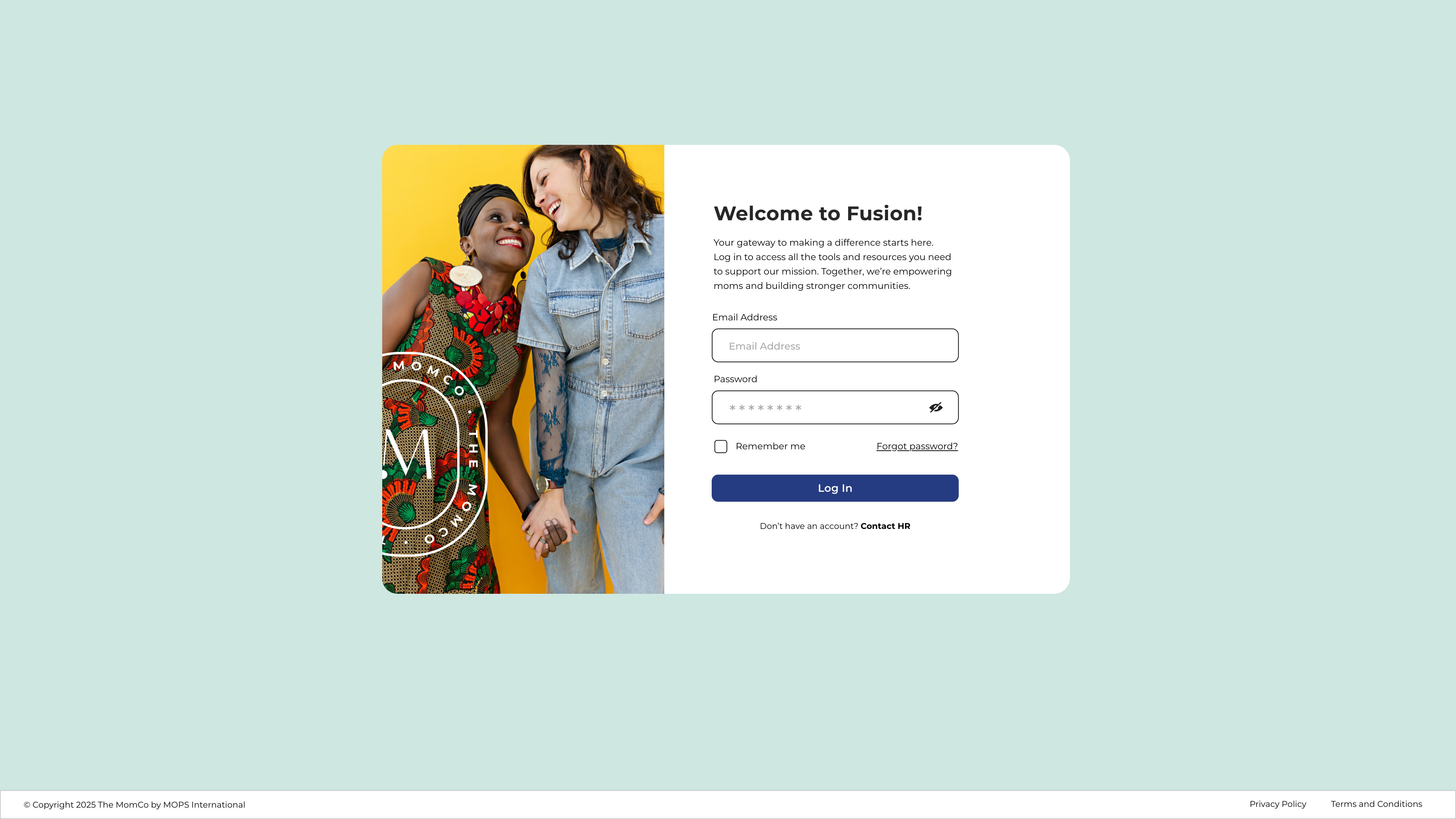
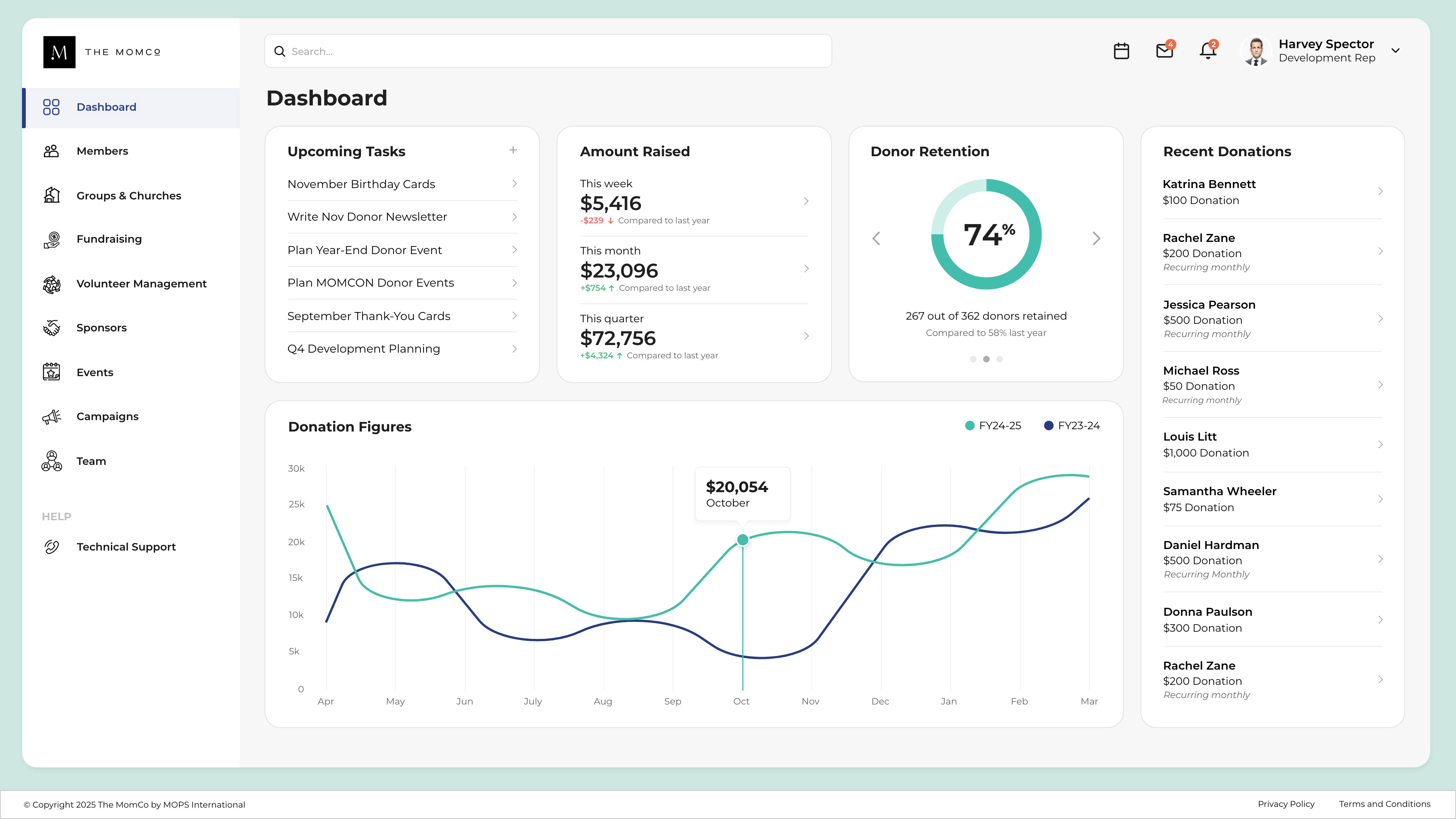
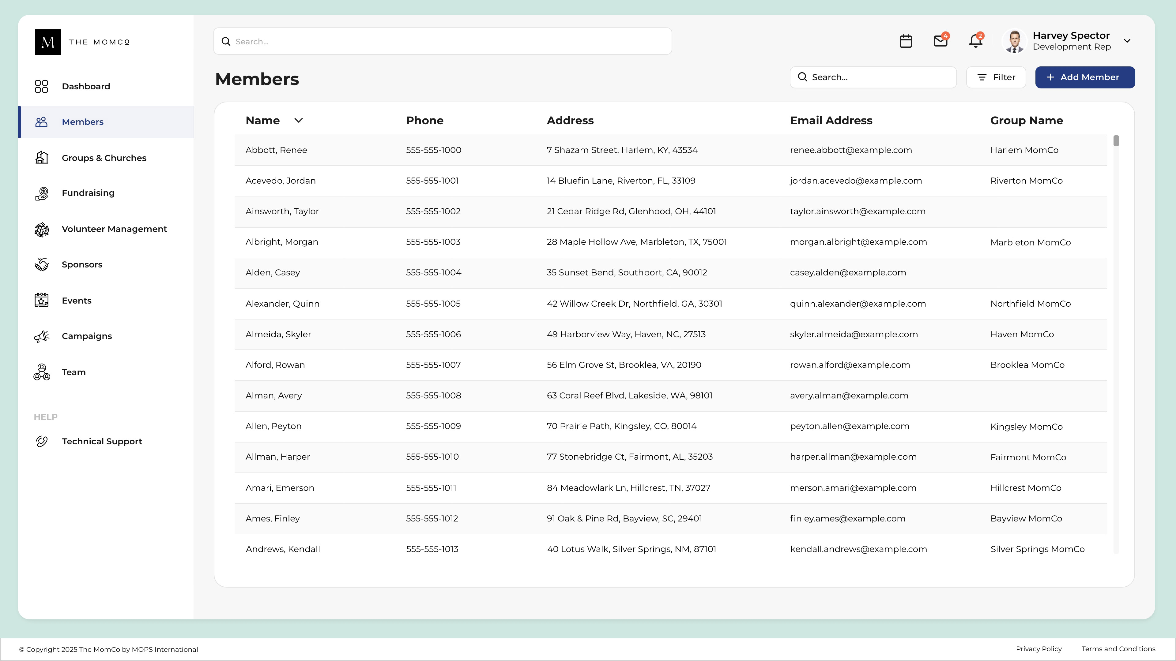
The redesigned Fusion CMS delivered a cleaner structure, reusable components, and a calmer, more focused interface. Each screen was intentionally designed to surface what mattered most, reducing distractions and mental load.
Measurable Outcomes:
52% increase in system adoption
37% faster completion times for key workflows
23% improvement in content accuracy
Fewer support requests and training needs
Higher user confidence and satisfaction scores
Users described the new CMS as “so much easier to use” and “finally something that makes sense.” Teams that once avoided the tool began using it daily, and new hires could learn it within minutes.
Reflection:
What began as a visual refresh became a complete UX transformation. By focusing on clarity, consistency, and user confidence, the new Fusion CMS turned an outdated internal tool into a system that feels modern, scalable, and human-centered.
Lessons Learned
Redesigning Fusion reminded me how much good design can change the way people work. It wasn’t just about cleaner visuals... It completely changed how teams felt about the tool and how confident they were using it.
Building the component library was one of the most valuable outcomes. It gave everyone a shared foundation and made it easy to maintain consistency across new features.
Bringing users into the process early made all the difference. Through interviews, testing, and observation, I learned where they struggled, what they avoided, and what they needed most. Their feedback guided every decision.
This project reinforced what I love most about UX. It’s not just about making something look better. It’s about helping people feel capable, supported, and confident in the tools they use every day.